Costco Taiwan: Elevating a legacy site to modern e-commerce standards
Costco Taiwan's e-commerce contributed only 4% of total revenue: the legacy platform fell short of Taiwanese e-commerce standards — dated search and filtering, a high-friction checkout, and no real mobile optimization. I led the modernization and mobile-first redesign, validated through A/B testing.
01Context & problem
Costco Taiwan's e-commerce lagged behind local e-commerce standards: a desktop-first legacy platform with unreliable search and filtering, a high-friction membership and checkout flow, and no responsive design. Members defaulted to shopping in stores — online, the result was low engagement and high cart abandonment.


02Research & insights
- Local merchandising: operations feedback and competitive analysis of local platforms showed Taiwanese shoppers expect prominent promotion logic and price-comparison cues — requiring a different product-card hierarchy.
- Mobile gap: analytics showed mobile traffic far outpaced mobile conversion — the single biggest opportunity.
- Content fit: Chinese product names and local promotional info didn't fit layouts designed for English, breaking card layouts and truncating key information.
03Design decisions
Three principles drove the redesign, each traceable to a research insight:
- Hyper-localization: layouts and product cards rebuilt for Chinese content and local merchandising — not just translated strings.
- Mobile-first flows: navigation and checkout rebuilt for the highest-traffic device.
- Test, don't guess: where local preferences were uncertain, we A/B tested key templates with marketing — letting data settle design debates.

04Before vs. after

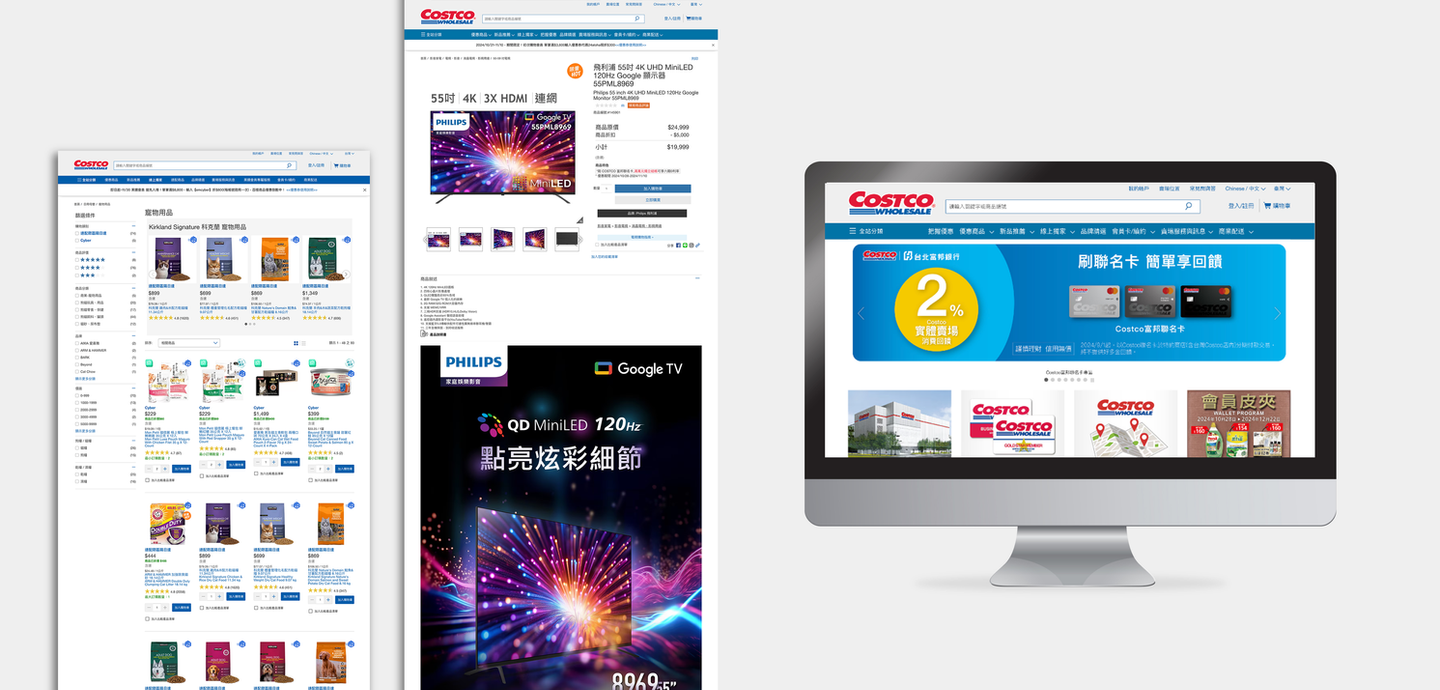
Visual & interface design (UI)
| Criteria | Legacy website (pre-redesign) | Redesigned website |
|---|---|---|
| Layout & grid | Cluttered banners and dense text with no visual hierarchy — a bulletin board of flyers. | Card-based grid with generous white space; product imagery becomes the hero. |
| Navigation | Deeply nested side dropdown; fragile hover states caused constant mis-clicks. | Full-width mega menu with icons; all categories visible at a glance. |
| Color & brand | Brand colors diluted by noisy yellow promo tags and flashing sale text. | Systematic palette: Costco Blue as anchor, Red reserved for CTAs and price drops. |
UX flows
1 · Search & filtering
2 · Membership & checkout
3 · Responsive design
From a promotion-driven interface to a user-centered, system-driven design — with friction removed at the highest-stakes moments: search and checkout.
05Outcome & reflection
- +40% membership growth — friendlier sign-up flows lowered the barrier to entry.
- Longer mobile sessions after streamlined navigation.
- A reusable global-to-local framework for future markets.
What I'd do differently: I would bring engineering into the requirements stage, not just the handoff. A locally important checkout feature — shipping items in one order to multiple addresses, a common gifting behavior in Taiwan — surfaced after the flow was already designed, and the backend rework it required pushed it out of the launch scope. Earlier technical feasibility checks would have let us design for it from day one, or phase it as a conscious decision rather than a late-stage cut.